
MTA App
Project Summary | UX/UI Design & Introduction of New Feature
The MTA is North America’s largest transit network, serving over 15 million people across NYC and nearby areas. Its app offers tracking, trip planning, and live updates, but many find it cluttered and less user-friendly compared to competitors like Apple Maps.
Improving ease of use and providing commuters more control during delays could make the MTA app the go-to source for NYC transit information.
Market Research
Train delays and track work are among the most frustrating issues for NYC commuters. Switching between transit apps for updates adds to the hassle. To understand why trips still feel difficult, we start by examining the features and gaps in Google Maps and Apple Maps.
Google Maps
Features:
Offers real time GPS navigation, traffic, and transit info. Also gives the latest information on businesses, including grocery stores, pharmacies, and other important places.
Pros:
Successful balance of providing information of establishments around a user's current location and providing directions on how to get from point A to B. Great balance and brand familiarity.
Cons:
Service status updates are not clear. It sometimes pushes routes that have more transfers or are longer to the top of the list.
Apple Maps
Features:
Apple Maps provides directions and estimated times of arrival for driving, walking, cycling, and public transportation navigation.
Pros:
Seamless integration of maps throughout iOS products makes it convenient for users to use since information carries across all products and "log-in" is not required on every device.
Cons:
Service status updates are not clear. Address and location accuracy is not consistent. Sometimes maps take you to a different physical location than the actual address.
User Research
We know from the market research that competitors lack accuracy in relaying information to users and that the MTA app has leverage as a key resource of time sensitive information. User interviews with public transit commuters uncovers the logos and pathos behind user frustrations and why they still reach for other transit apps.
Commuter Frustrations
Inaccuracy in arrival or departure times of trains.
Saturation of information in the MTA app discourages users from reading content.
Unclear directions for walking in and out of the correction station/exit.
Track maintenance affecting train schedules.
Lack of communication surrounding delays (cause, location, how long of a delay, etc.).
Constantly refreshing app to get updated information.
Research Goal:
We want to understand the commuter’s experience and uncover physical and technical pain points that could be resolved through design.
Problem:
Commuters experience frustration when train delays occur and they do not know what move they should make because of the lack of information.
Point of View Statement:
I’d like to explore how to give more autonomy to commuters who experience disruptions to their trips because when they don’t know what’s going on, they feel like sitting ducks.
How Might We…
… mitigate commuter frustrations with delays or reroutes?
… make the commuter’s transit experience more seamless despite disruptions?
… mitigate situations where commuters need to cross reference multiple apps to get the most accurate transit information?
UX Design | Low Fidelity
User research showed that frustration with trip delays stems from a lack of transparency, leaving riders unsure of what to do next.
To help, I proposed a Reroute feature similar to the “faster route” alerts in Google and Apple Maps for drivers. This would give transit riders clear info on delays and alternative options, improving their experience.
Reroute Feature
The MTA app is the first source for NYC transit updates, so it makes the most sense for it to push this feature utilizing the live updates on train lines that it already generates.
Offer reroute options- take a faster generated route to avoid delays
Receive live updates on delay rather than rerouting
See cause of delay
Key Features:
Paper Test Results
Using paper mockups of the reroute flow helped identify where users struggled, like whether selecting “reroute” changes their route immediately. It also revealed helpful features, such as the “view more options” button. These insights highlighted UI improvements to optimize the reroute and live update flows.
Paper flow test for Reroute
In this flow, the user experiences a delay and selects a reroute option that the platform provides.
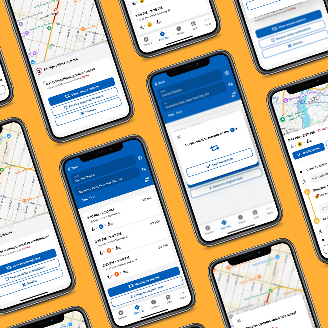
UI Design | High Fidelity
Reroute
The user experiences a delay and selects a reroute option. The pop-up shows the cause of the delay and gives the users a choice in how to navigate the disruption in their commute. The user would select the next course of action that makes most sense for them.
Receive Live Updates
The Receive Live Updates feature works in tandem with the Reroute flow. If the user would rather remain on their current route but would like to receive live updates on the status of the delay, they can turn on their notifications for updates on this specific disruption.
User Testing
Through the usability test, I was able to identify pain points that the users experienced while moving through the flows and confirmed elements of the UI that were successful.
Constructive Feedback
70% of participants did not find the notification button for the delay to be clear.
Participants were concerned about losing the original route they were on if they tapped the option to view reroutes.
Users confused by process of receiving delay notifications because they did not receive a formal confirmation to receive updates
Insights & Patterns
Commuters ultimately want to know what’s going on so that they can make informed decisions with the information they have
Users want to know that they have options & don’t want to feel “stuck”
UI Iterations
Solutions
Thanks to the constructive feedback and the identified insights & patterns from the user testing, UI iterations were made to the key screens of the Reroute and Receive Live Updates Flows.
1) New “receive notifications” button for users to get updates on the delay.
Old UI
New UI
2) Addition of confirmation screen so users know they are now rerouting or will begin receiving live updates, depending on their selection.
3) Return buttons on the reroute option screens so users can see the previous options they had generated.
Old UI
New UI
Final Prototypes
Reroute Feature
Selecting a new course because there is a disruption on the original route.
Receive Live Updates
Choosing to receive updates on the delay while staying on the same route.
Conclusion
The MTA app is a treasure trove of information that is waiting to be harnessed. With all the data it collects as NYC’s public transit provider, it has the capacity to push features and resources for commuters that go beyond what other platforms can do. The added Reroute feature sets a precedent for the MTA app that it can take advantage of its data infrastructure and provide autonomy to its riders when they experience disruptions on their commute.
Afterthoughts
What a trip! (haha)
This project taught me the importance of knowing when to put aside my urges to do design work that falls outside of the project scope. I worked with the existing material and improved the user experience even though there might have been original UI elements that I didn’t necessarily agree with. This was a great learning moment for me to experience staying on track and completing my deliverables without getting distracted. Two things can exist at once and something I deem as “good” or “bad” design does not make them mutually exclusive.
What’s next?
With the opportunity to circle back and work on more features, I would like to work on additions that would optimize the commuter’s experience. Some future updates might include:
Departure reminders that notify commuters when they should head out to catch their train.
Ticket purchases for different transit options (Airtrain, LIRR, ferry, train tickets, etc.) are consolidated in one place on the MTA app.
Quick check with AI for when users want a quick answer for transit and route related questions.